The Hidden Message in Wendy’s Logo
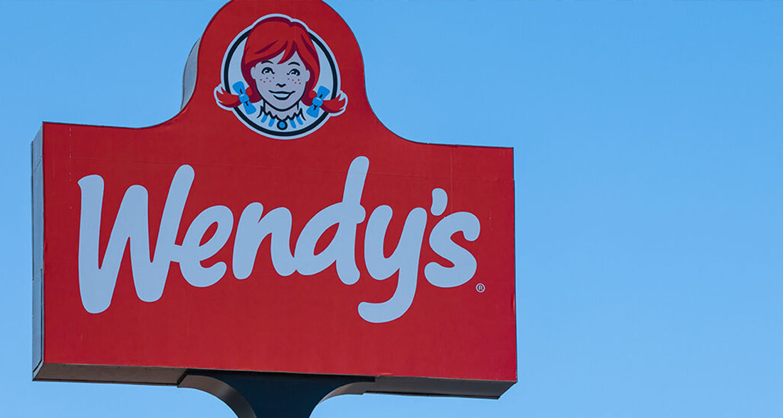
If you’ve ever enjoyed a meal at Wendy’s, you’re probably familiar with the cheerful logo featuring a girl with bright red braided pigtails and a sprinkle of freckles. This friendly face isn’t just a fun cartoon; it represents something deeper—a sense of comfort and nostalgia that reminds people of home-cooked meals.
Wendy’s was founded in 1969 by Dave Thomas, who wanted his restaurant to reflect the warm and welcoming spirit of his fourth child, Melinda Lou “Wendy” Thomas (now known as Wendy Morse). Dave, who had previously worked with the famous Colonel Sanders at Kentucky Fried Chicken, understood the power of a strong brand character.
Wendy shared, “He wanted a character, because he worked for the Colonel at Kentucky Fried Chicken and knew how much that persona mattered. He said, ‘Wendy, pull your hair up in pigtails.’ So, I did. He got his camera and took pictures of me and my sister and said, ‘Yep, it’s going to be Wendy’s Old-Fashioned Hamburgers.’”
Since its opening, Wendy’s menu has grown to include much more than just old-fashioned hamburgers. Now, you can enjoy their famous Frosty or a warm bowl of chili. The logo has also seen some changes over the years, keeping its nostalgic charm while updating its look.
About ten years ago, Wendy’s refreshed the logo to give it a modern twist while still honoring the original design. They softened the features of the iconic redhead and refined the lettering, making it appealing to both new customers and loyal fans of the brand. This perfect blend of old and new helps keep the logo timeless and familiar.
However, something intriguing happened with the latest design. Some people believe that the logo has a hidden message that plays tricks on our brains.
A commercial logo expert pointed out, “Some say that this makes you associate the brand with the comfort of home cooking. Although this is something you may not notice consciously for years, it will leave an imprint on your brain.”
Curious about what they meant? If you look closely at Wendy’s ruffled collar, you might see the word “mom” cleverly hidden there! Once you notice it, it’s hard to ignore. According to Business Insider, this “mom” effect is especially clear in the red version of the logo, which you often see on Wendy’s Styrofoam cups.
The way the ruffled neckline curves creates the illusion of the word, making it a fun little secret that many fans have enjoyed discovering.
When asked about this surprising find, a Wendy’s spokesperson responded, “We are aware of this and find it interesting that our Wendy cameo has ‘mom’ on her ruffled collar.
We can assure you it was unintentional.” So while the hidden message may not have been planned, the feeling of warmth and family that Wendy’s represents is definitely a big part of the brand’s identity.
What do you think about this unexpected message in the Wendy’s logo? Does it make you feel more connected to the brand? We’d love to hear your thoughts!
Please share your opinions with us and pass this story along so we can hear from others too!


